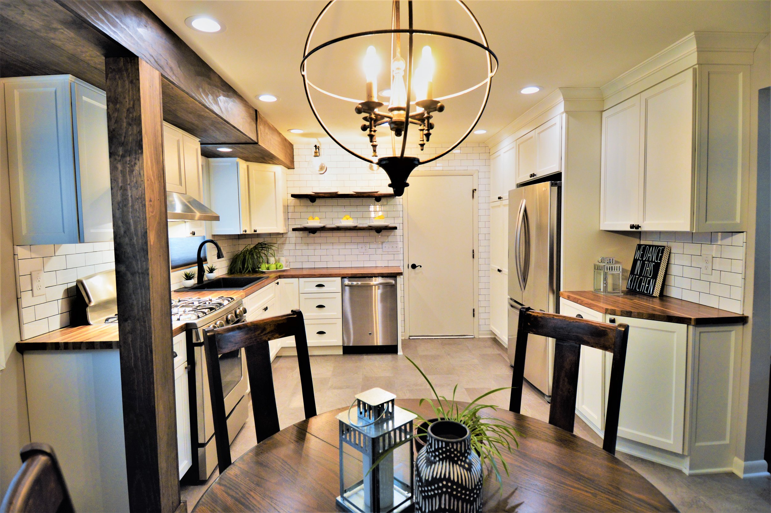
When it came time to remodel their kitchen, our clients had three words in mind – open, useful, and bright. Simple enough it would seem, however, transforming the compact and non-functional space on a tight budget would prove to be a bit more challenging than one might imagine. The space planning was simple – tear it all out and start fresh.
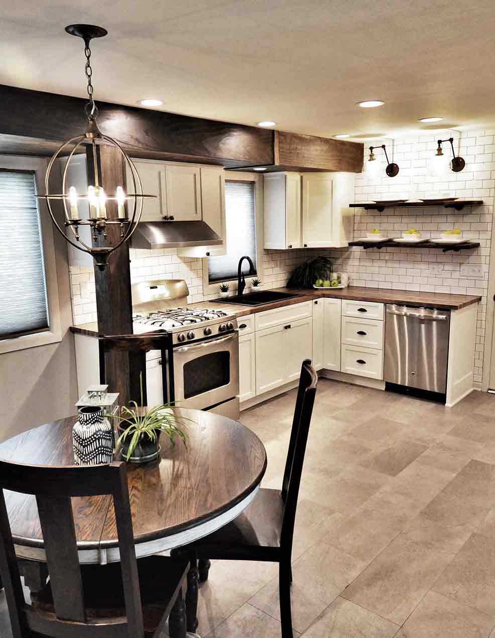
The original design called for the full-length soffit to be removed and the space to be completely opened up. However, it became apparent that the soffit housed a beam which supported the cantilever on the back of the home and therefore, would need to remain intact to avoid a huge cost increase. At that point our focus shifted to camouflaging the soffit to make it look like it was always supposed to be there and that we chose to incorporate it into the design. We decided that the soffit would be wrapped in pine, stained dark and aged, and made to look like a large wooden beam. The whole basis of our design would now be based around this beam. The budget didn’t allow for us to remove walls or add space, so our focus became creating more useable space within the room itself making sure everything we added had a very specific function. Light colors, proper lighting, and a functional cabinet layout would be key to opening this space.
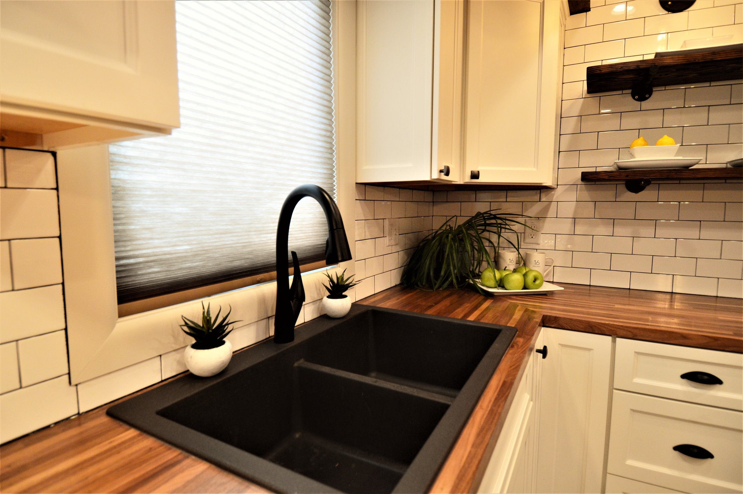
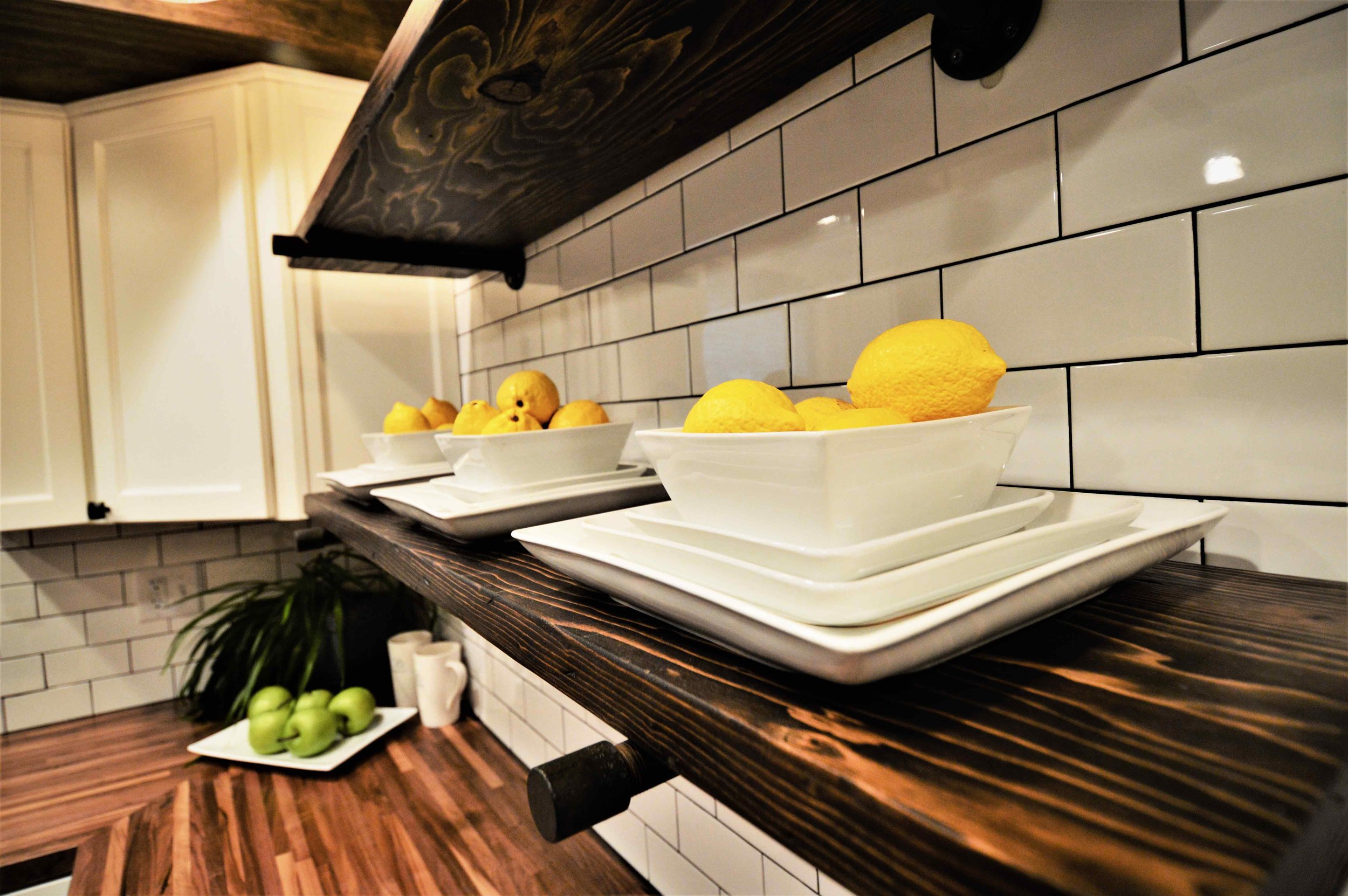
The clients really wanted to keep with the overall “farmhouse” look. White cabinets were used to juxtapose the dark beam and butcher-block counters were used to bring in a rustic natural feeling to the kitchen. To avoid the kitchen from feeling like it was boxed in with cabinetry, pine shelving with iron accents were used to keep a more open feel.
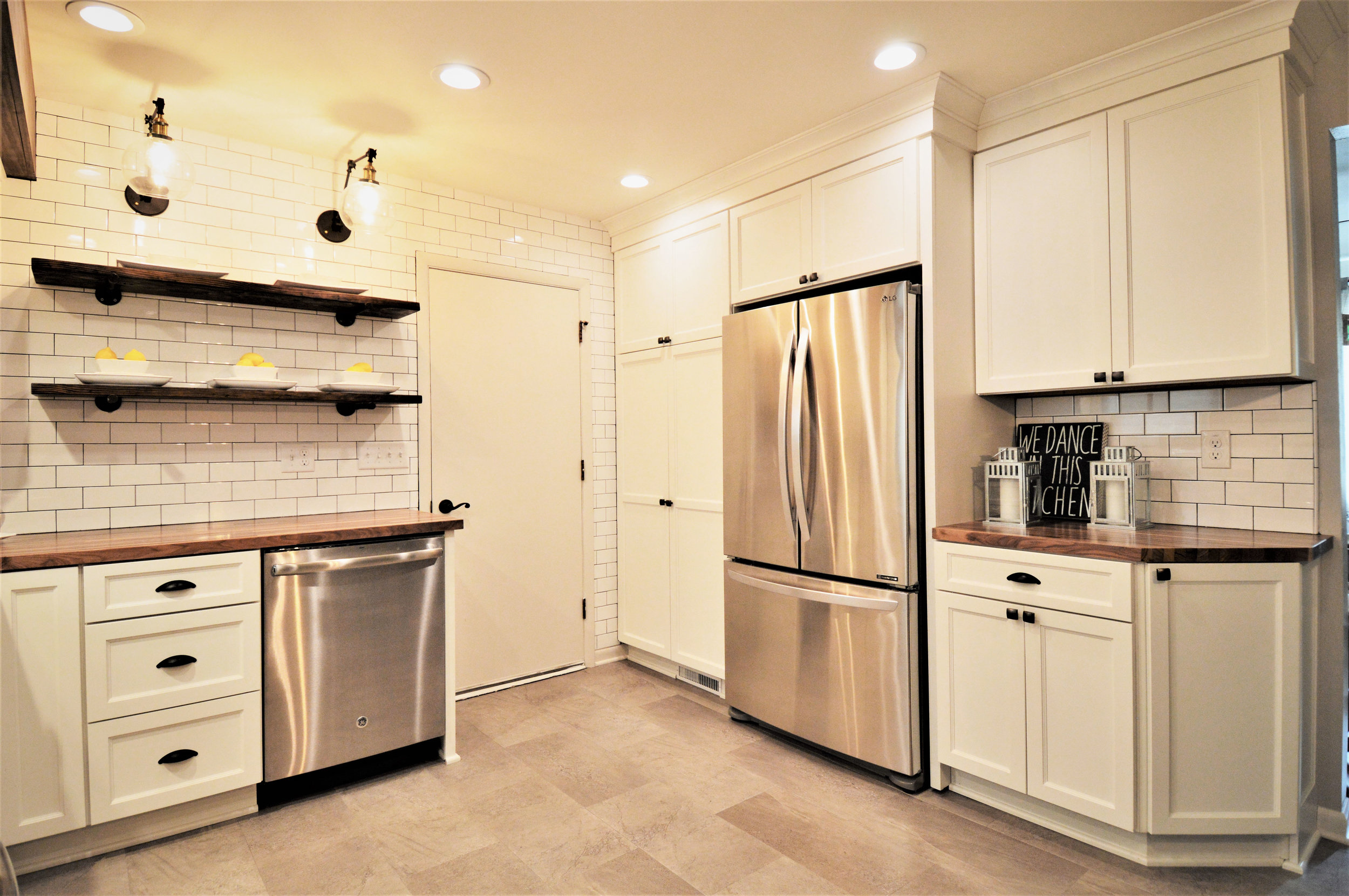
3x6 white subway tile was a must. It’s contemporary yet vintage, it’s simple, and most importantly it’s something every farmhouse kitchen needs. It is a perfect way to tile a full wall and not make it so busy that it detracts from the overall look of the kitchen. Black grout was used to help make the pattern stand out and the wall was lit with accent sconces to add a hard edge to the more feminine look of the cabinets.
The closet in the kitchen was useless not to mention an unappealing distraction and an un-needed barrier in the space. By removing the closet, we were able to provide a proper pantry in addition to a full-size refrigerator. The pantry also offered a space to hide the microwave and keep it off the counter allowing for more work space.
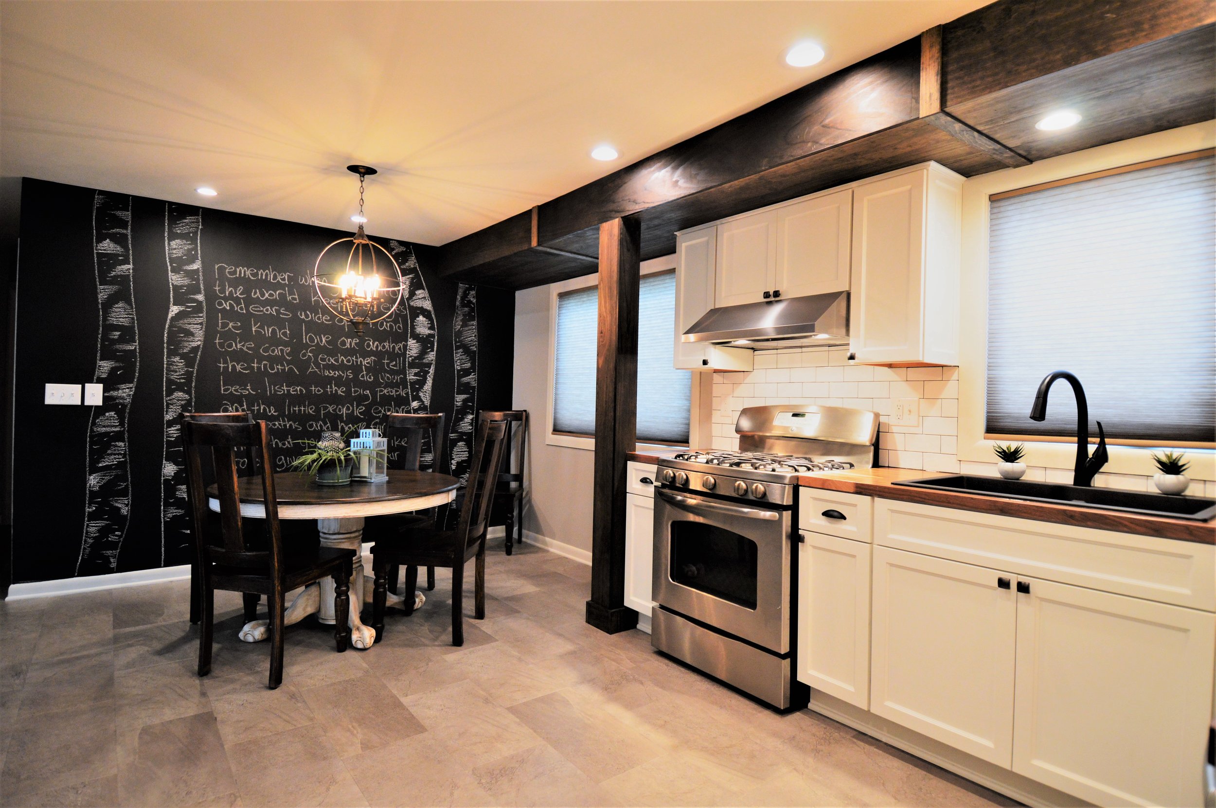
The clients still needed an eat-in kitchen but the goal was to make it feel more integrated into the kitchen, not divided off. Because this is a smaller kitchen this allows for the table to be used as a work space as well with food prep. Luxury vinyl tile was used on the floor to help conserve some cost, and the main focal wall was painted in chalkboard paint to allow for affordable, changeable art. Lastly, the entire space was given new lighting and a fresh coat of paint.
Mixing metals was important to the overall look of this kitchen. We needed the shine of stainless steel to balance out the matte finish on all the iron cabinet pulls and fixtures. It helps give the kitchen a masculine edge to balance out the femininity of the tile and cabinets.
In the end we were able to provide our clients with everything they were looking for while staying well within their budget. The overall kitchen space was not increased by one single inch, yet they gained an incredible amount of useable space. The kitchen went from extremely dated, close off, and barely functional to a space that is open, easy to use, and a place our clients want to spend time in.